
State Farm
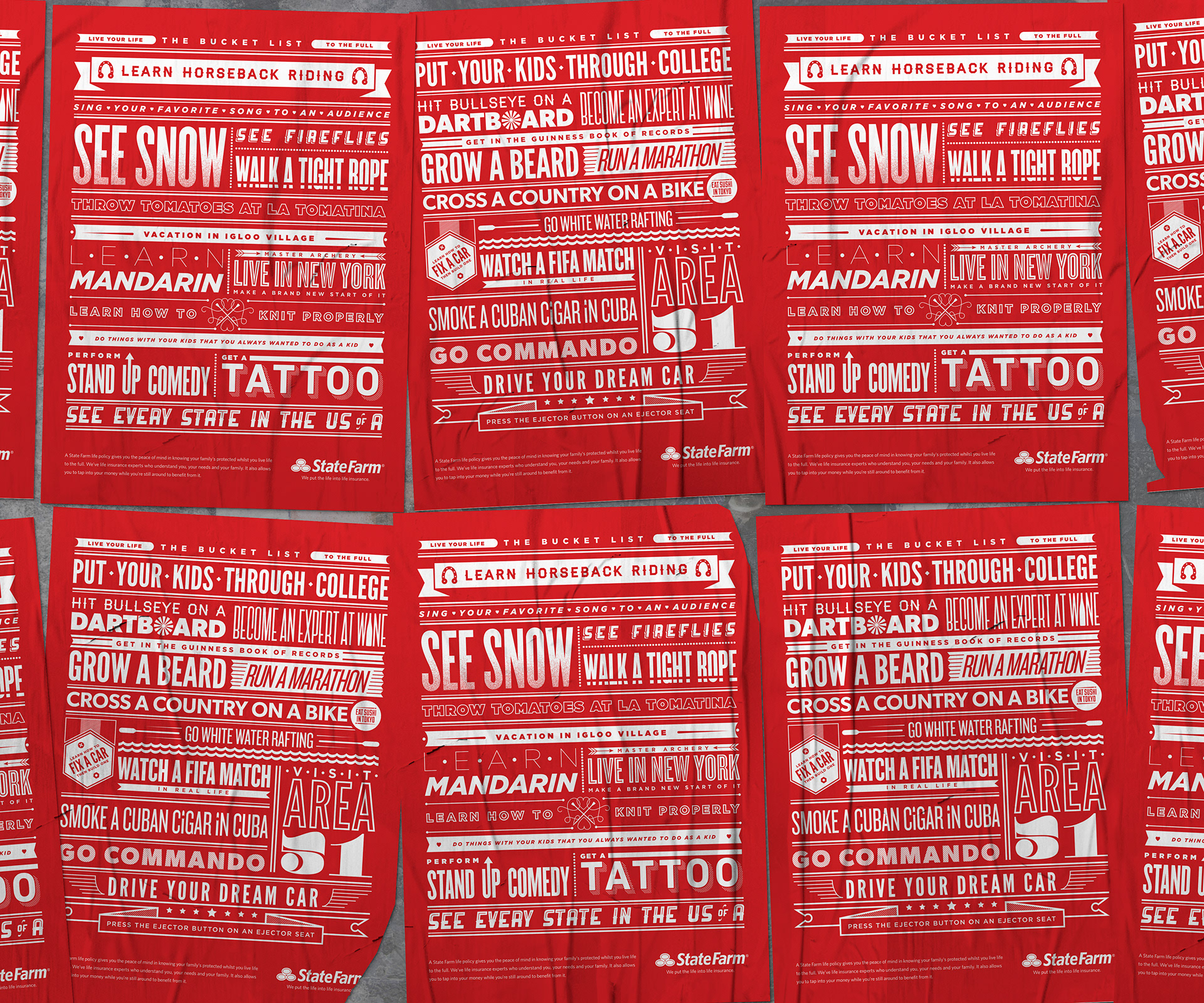
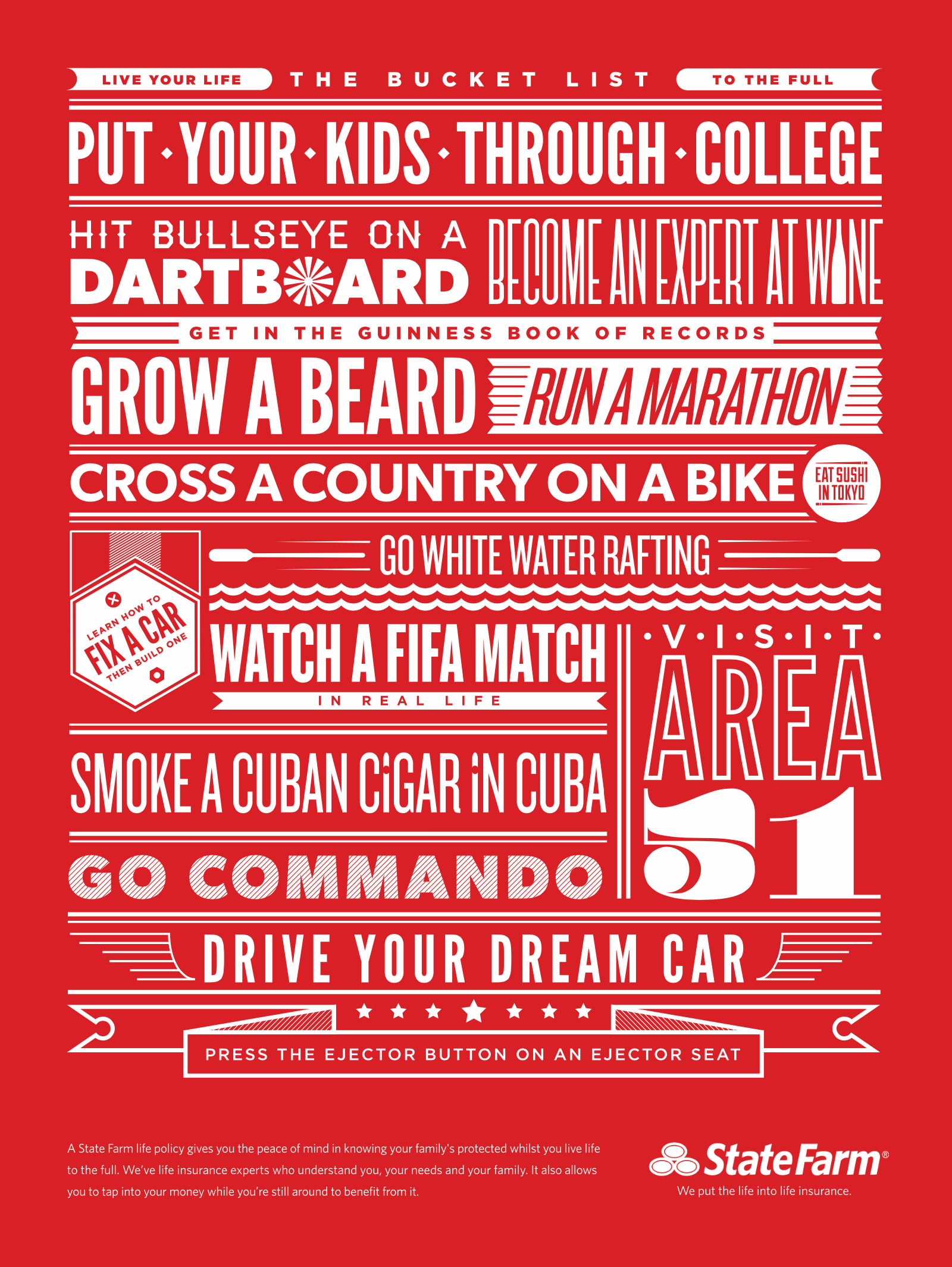
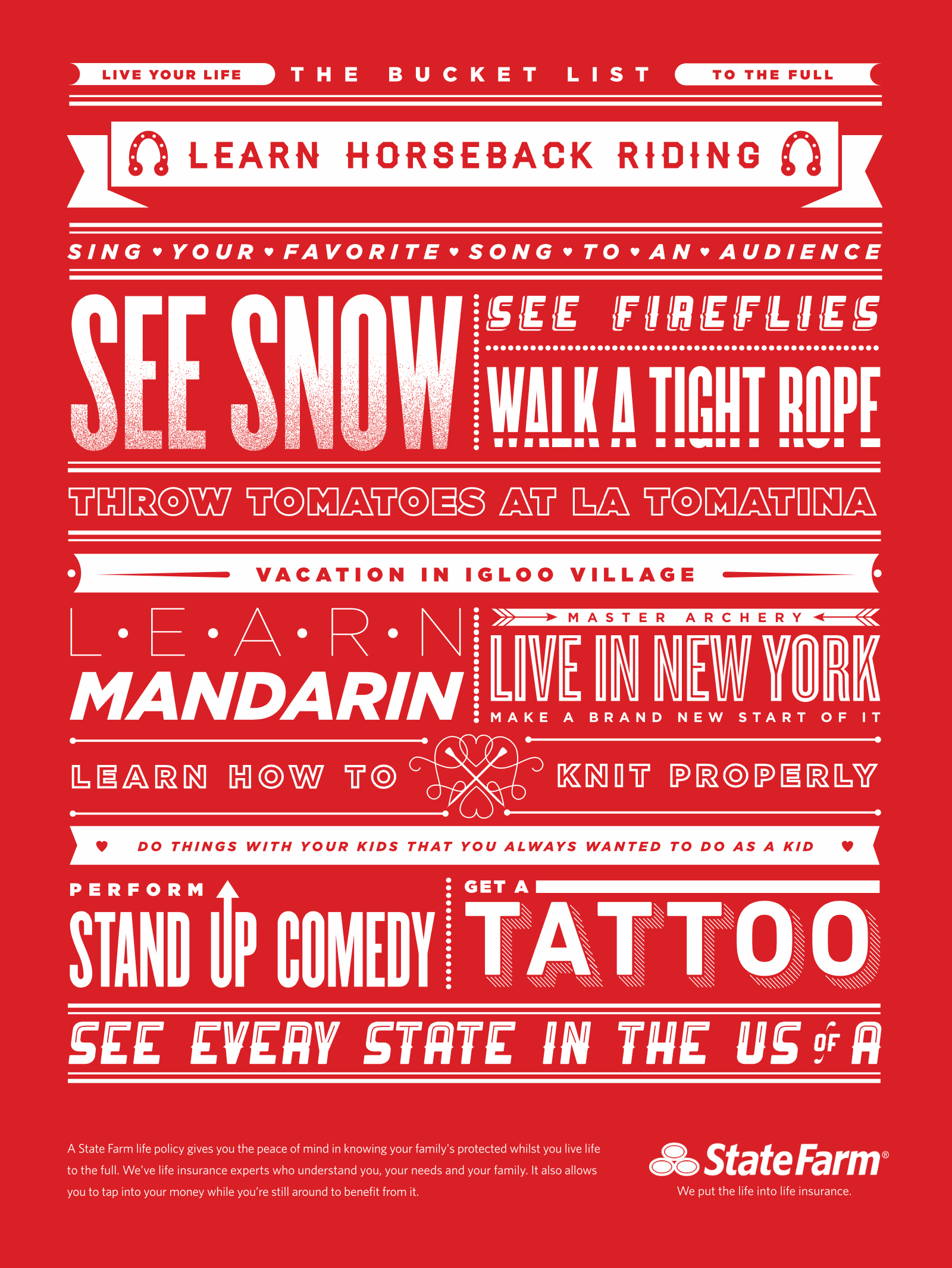
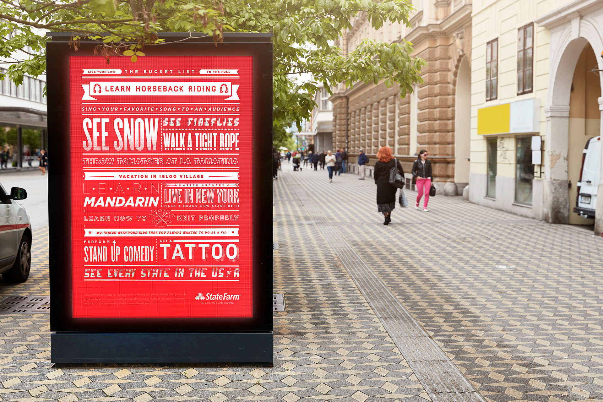
Inspired by a personal design exploration, this campaign reimagined State Farm’s local advertising through the lens of a vintage letterpress type sampler.
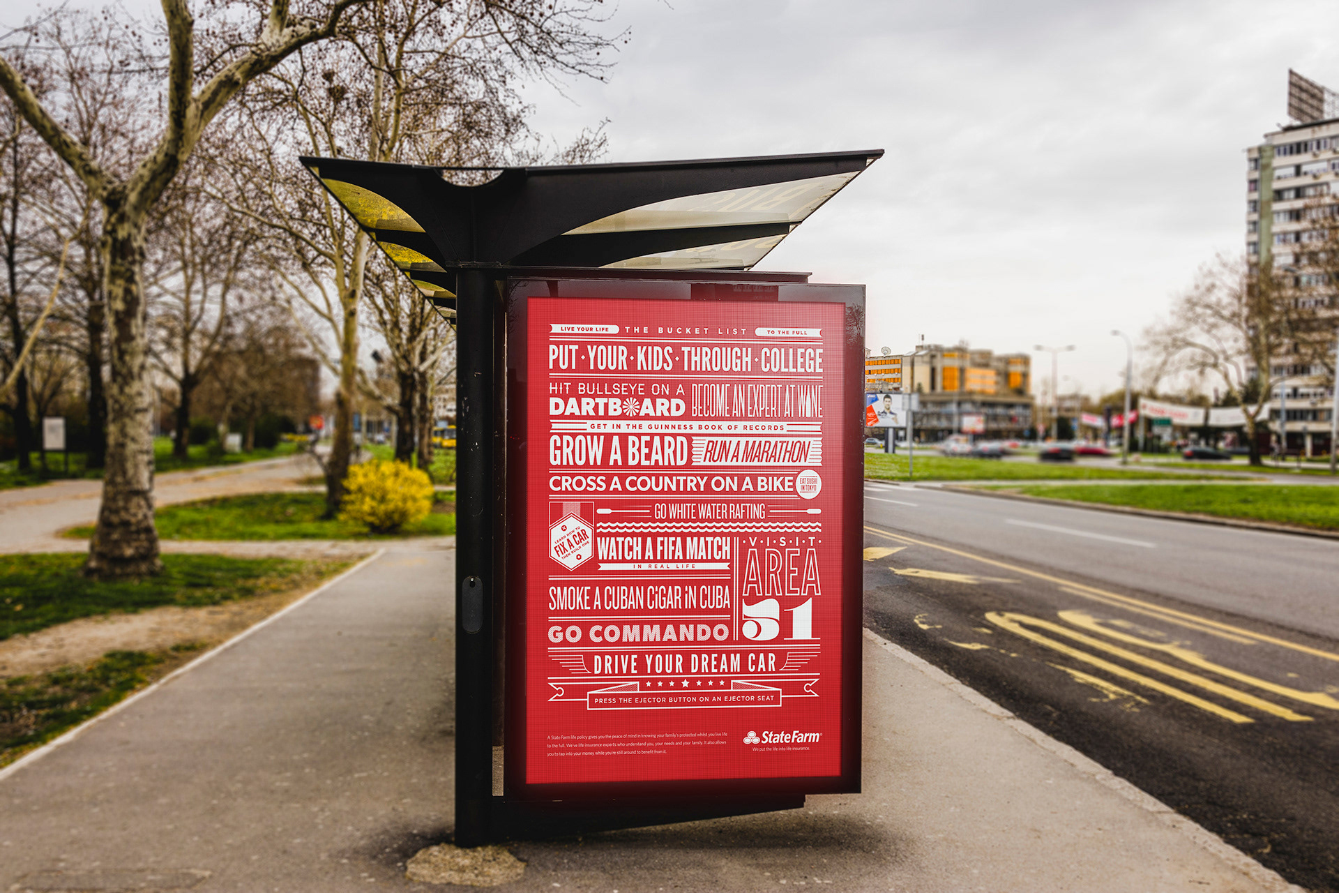
Working with DDB Chicago, the concept transformed the idea of a bucket list into a bold typographic system using State Farm’s signature red palette and tactile print-inspired design. The campaign was rolled out across the Chicago metropolitan area through transportation hubs and wild postings.
As Art Director, I translated the concept into a cohesive visual direction, creating designs that balanced brand recognition with a handcrafted, nostalgic aesthetic.
Client State Farm
Agency DDB Chicago
Creative Direction Wayne Robson, Matt Collier
Art Direction Teresa Wozniak
Design Teresa Wozniak
Agency DDB Chicago
Creative Direction Wayne Robson, Matt Collier
Art Direction Teresa Wozniak
Design Teresa Wozniak